Optical designs on paper rarely match the system’s installed performance, and this is especially true for optical systems used in harsh environments, including astronomical, space domain awareness (24/7), atmospheric research, and lasercom/free-space communications, among others. This on-paper vs. real-world performance disconnect can, if not understood, result in an inferior system—and the expense and delay of fixing it.
Countless factors influence the installed performance of an optical system. But if the “on-paper” design is diffraction-limited, it generally cannot be improved. Not all applications and technologies require or can deliver this level of installed performance. Regardless of these nuances, the diffraction-limit is always λ/4 PV wavefront (λ/14 RMS wavefront), where λ is the wavelength of light.
Spot diagrams can be helpful to evaluate and further optimize a given design iteration. Companies present them to potential customers, along with other output data. But, for various reasons, critical information can be missing.
Learn to spot missing data
Figure 1 shows examples of seemingly complete spot diagram examples missing vital information.
For example, Fig. 1 shows the spots for a two-mirror, 510 mm clear aperture (CA) f/7.5 true Ritchey-Chrétien (R-C) Cassegrain telescope. A promotional brochure featuring graphics similar to these figures might have the following description: “Company Z is focused on absolute performance and delivers research-grade optical systems for modern detectors and field sizes, which offers our customers superb quality with pinpoint resolution.”
Unfortunately, the above promotional sentence is ambiguous since nothing is quantified. The statement might imply small pixels and a large detector, but the company might be optimizing its design for the old 25 µm film grain standard and a sensor of 12.7 mm per side. If the buyer believes the promotional statement to mean 4 µm pixels, they might also assume the outer black boxes are 4 µm per side, which implies the spots are much smaller.
A company showing the graphics in Fig. 1b (which are the three boxes at the right in Fig. 1a) might state that this is the spot performance for their optical design halfway out (far left box), to the extreme corners (far right box), for whatever field size they may or may not quantify. Also, not showing the first three boxes, as shown in Fig. 1a, makes the field appear more visually consistent in spot size. In fact, all the spots in Fig. 1a are below the diffraction limit and are actually small.
Another example of a spot diagram with missing information is one that has neither boxes nor quantifiable data, presenting only spots (see Fig. 1c). Without quantification, buyers should be wary of letting their imagination fill in the details. A spot diagram that doesn’t specify the dimensions should signal the buyer to seek out the missing information.
All examples shown in Fig. 1 show spots without quantified data. A buyer looking at Fig. 1 examples cannot discern the spot size, so they could be the size of an atom, or a hot air balloon. Another sales tactic is to use overly large box sizes of 30, 40, or even 200 µm per side to make the spots appear smaller.
Closely reading the description accompanying the diagram is crucial. For example, “Our spot performance is no worse than 10 µm” may sound like quantified information, but it fails to indicate whether their spot is in radius or diameter. When a description uses the phrase “spot size,” not spot radius or spot diameter, it can mean either. If the 10 µm statement is the spot radius, the spot diameter is 20 µm. That isn’t very good (5.32x worse) when your detector’s pixels are 3.76 µm.
Using a narrower waveband (450–650 nm) instead of the full 400–700 nm visual spectrum and/or artificially weight a color is also misleading. Some companies weight 550 nm to carry twice as much value as other colors, but this weighted method is not ideal if the optical system you’re designing or using must use the entire visual spectrum.
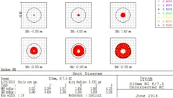
Figure 2 shows all the data for the two-mirror, 510 mm f/7.5 true R-C Cassegrain (no corrective lenses) used to create the graphics in Fig. 1. These spot diagrams show performance over a 30 mm focal plane diameter, which has a 15 mm off-axis radius. In Fig. 1 showing an airy diameter (black circle inside each box in Fig. 2), the box width is missing, and the boxes are shrunk. These spot diagram choices result in the boxes appearing smaller in Fig. 1 than in Fig. 2—serving as a sign to seek more details or perhaps another solution.
Recognize a complete spot diagram
A complete spot diagram chart (see Fig. 2) delivers helpful information, but understanding what the graphics represent requires first looking at the following details:
- Units: both for the waveband and for the spot data
- Waveband of interest
- Box width
- Airy diameter or radius callout, quantified in microns
- Airy diameter black circle within each box
- Field size: IMA
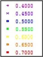
In Fig. 2, the upper right corner of the spot diagram shows the waveband of interest (also shown in Fig. 3), which, in this case, is the visual spectrum in microns: 0.400–0.700 µm (400–700 nm).
Near the lower left region of the spot diagram in Fig. 2, the “Units are µm” appears (also shown in Fig. 4). At the extreme lower left corner of Figs. 2 and 4, the diagram calls out the box width as 18 µm.
The lower left region of the spot diagram in Fig. 2 (also shown in Fig. 4) lists the root mean square (RMS) and GEO radius for the spot sizes. The GEO radius corresponds to 100% of the light, while the RMS radius is equivalent to 80% encircled energy. If the design’s RMS spot radius matches or is smaller than the airy radius (seen to the right of “Units are µm”), the on-paper optical design is diffraction-limited. Designing past this point can offer some manufacturing margin but cannot achieve the installed performance of a system that is, say, 1.5x or 5x “better” than the diffraction-limit; this would defy the laws of physics.
Be mindful that the color graphic portion of this on-paper design representing the spots shows 100% of the energy (GEO), not just the RMS (80% encircled energy), in the graphics. Paying close attention to this level of detail is another reason to look at data (numbers), not just the graphics.
Just above the RMS and GEO radius is “Field,” with numbers 1 through 6 as column headings to the right of “Field.” These numbers correspond to the six IMA field locations (see Figs. 2 and 4). IMA is the IMAge plane, where the light of the optical path ends. Field 1 (“IMA: -0.000 mm”) is the on-axis center of the light path/field. Field 6 (“IMA: 15.000 mm”) represents the furthest off-axis location, which in this example is a 30-mm-diameter focal plane.
Looking at the RMS radius numbers for Fields 1 through 6, we can see that the RMS spot radius goes from 0.022 µm on-axis to 4.135 µm at 15-mm off-axis. If we compare these to the airy radius, which is typically the central wavelength (550 nm, in this case), we see it is 5.033 µm (radius), and, therefore, the entire 30-mm-diameter field is diffraction-limited. We can convert any of these spot radius numbers to diameter, which does not change the colored graphics portion of the spot diagram. The airy diameter is 10.065 µm (550 nm wavelength).
Within each of the six field location boxes, a black circle represents the airy diameter/diffraction-limit, which in Fig. 2 is based on 550 nm wavelength.
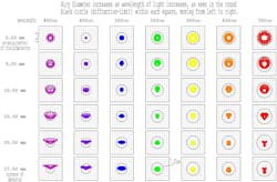
The spot matrix shown in Fig. 5 illustrates how the airy diameter (black circle) changes relative to wavelength for a Dream 20 in. f/5.6 mR-C using a single corrective lens element. Also, the colors are shown in columns with the on-axis (center of the field) in the top row and the extreme corners of an IMX461 detector (55 mm diagonal using 3.76 µm pixels) shown across the bottom. You can see how the airy diameter (black circle within each box) grows as we go from UV on the left to red on the right.
Figure 5 uses a box width that is 15 µm per side, with 10 inner gray boxes per direction within each black box, making each inner gray box 1.5 µm per side. It’s critical that the viewer look for the box width and, therefore, the scale; otherwise, the viewer can misinterpret the data. Doing so is no different than the need to look at the key to understand a topographical map.
It’s crucial to glance first through the numerical data within a full spot diagram (see Fig. 2) or spot matrix (see Fig. 5), before spending too much time looking at the color graphics portion. The reason for this is illustrated in Fig. 1. Always remember the diagram or matrix is simply the design on paper. Thousands of variables play a part in producing the combined installed performance of the optical system, which is often quite different from the on-paper design “performance.”
Get the details you need
When the spot diagram graphics lack the level of informational detail demonstrated in Figs. 2 and 5, request more data.
Also, a company might state their given optical design has an on- and off-axis performance of 1 and 1.5 arcsec, respectively, over the full visual spectrum (400–700 nm); a luminance filter. But this data might be from their on-paper optical design “performance,” not short (5–30 seconds) individual images taken through the installed optical system. When the actual and installed optical system produces 3.5 arcsec performance from a high-elevation, pristine mountaintop while imaging through a narrowband filter, it is evident that the design and physical product do not match one another. This is especially true if the angular resolution of the instrument’s aperture is 0.3 to 0.4 arcsec at 550-nm wavelength. 1–1.5 arcsec on-paper “performance” is 3-5x worse than the diffraction limit.
Optical design alone does not account for production variations in the quality of all optical surfaces, improperly aligned and spaced mirrors and lenses, the thermal time constant, and therefore performance loss at the boundary layer of all optics, low-stiffness supporting structures that can’t keep the optics aligned or in focus in real-time, non-athermal mirror and lens mounts distorting the optics they support as temperature changes, and on and on.
Chasing real-world performance means living in the details. Knowing how to read and what to look for in a spot diagram can allow a buyer to see through promotional statements selling an on-paper optical design, not the real-world performance of the actual optical system. Looking and asking for critical pieces of information missing from a spot diagram can be a great way to determine if the design is worth investing in.


